If data analysis triggers a primal fear in you, and the thought of a cross table gives you goosebumps, fear not! We have something that will dispel those concerns. How about a world where drawing conclusions from research, tracking trends, and comparing results over time don’t require technical skills? The gates to this world are wide open before you.
Regardless of the industry and the nature of the research, online survey authors can be divided into two main groups:
- The Pros are masters of the most advanced questionnaire logic and tackle the analysis of results with a smile as if they were just waiting for an evening with popcorn and a new season of their favorite Netflix show.
- The Average Joes start feeling that goosebumps sensation again when they hear from their bosses at work: “John/Lucy, please prepare a report on the latest satisfaction survey for the board meeting on Monday and present the conclusions.”
That goosebumps feeling again, huh? Don’t worry. We all have it. Well, almost all of us. Except for that tiny fraction of pros who, like Clark Kent, have already donned their blue-and-red suit and gotten to work. But hey, chin up, not everyone wears a cape. But everyone can easily prepare data in a form that is easy to understand and draw conclusions from today.
Want to know how? I’ll show you right away.
What are trends and cross tables?
We’ve conquered the fear and regulated our breath. Now, it’s time for a bit of theory.
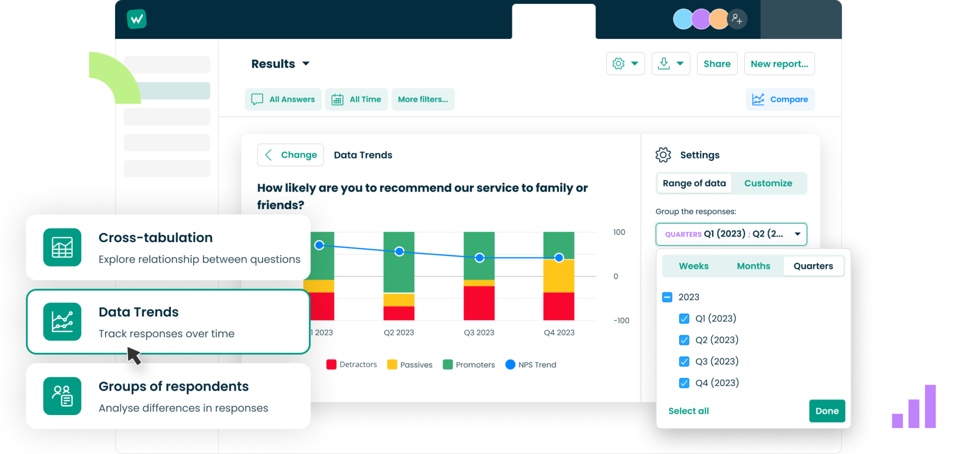
According to the online dictionary, a trend is the current development direction in a particular field at a given moment. In online survey analysis, a trend presents the result of a specific study over time.
Imagine you run an online store. After each transaction, you send customers a short satisfaction survey. By presenting the results of this survey on a chart over the last 3/6 months, you can easily see whether customer satisfaction with your products has declined, increased, or remained at a similar level in the last quarter/half-year.
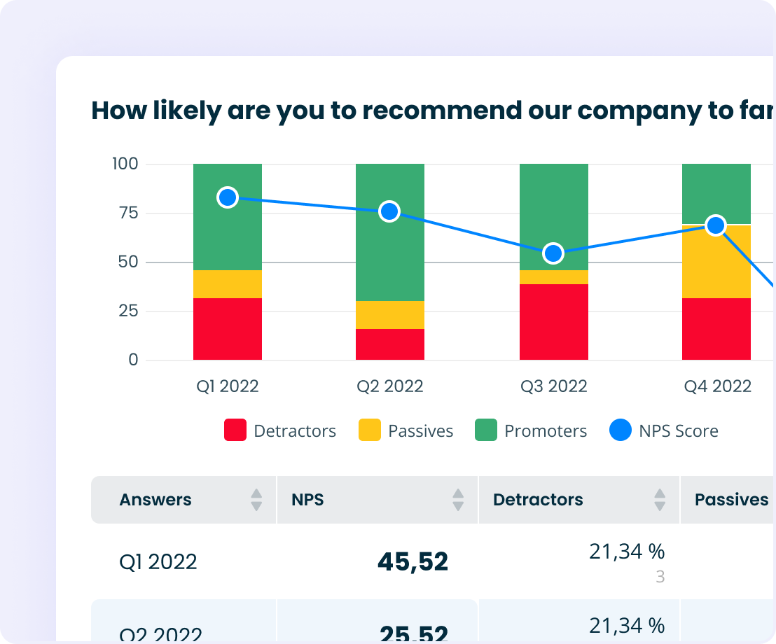
The cross table, likely to evoke more emotions and negative associations with Excel, on the other hand, allows the comparison of two sets of data analyzed during a specific period on one chart. Trends and cross tables can be found by Startquestion clients under the comparison tab. I’ll explain how to use them shortly.
Meanwhile, let’s use an example to illustrate using a cross-table to analyze survey data.
Let’s say you run a catering company and prepare a menu of ready-made meals. From a series of questions posed to internet users while researching the market, you can extract pairs of answers that will allow you to develop an optimal proposal (the number of meals consumed/caloric needs or physical activity/type of preferred diet, etc.). Below is an example of such a survey created in Startquestion.
Click to see other ready-to-use survey templates for CX, HR, and market research.
“In data analysis, trends show us changes over time. Based on them, we can infer the trends of responses and predict the direction in which the analyzed phenomenon will go. Meanwhile, the cross table provides an opportunity to deepen a specific response because it allows for the comparison of answers to a specific question, such as with the department in the company or the respondent’s place of residence,” explains Laura Dołęgowska, Product Marketing Manager at the Startquestion platform.
Analysis of results without specialized knowledge
It’s not so scary, right?
Now that we’ve covered the theory, let’s move on to practice. Here’s how Startquestion clients can use data analysis tools with skills worthy of one of Marvel’s icons, even if they last wore a superhero cape at a school carnival in 2006.
Let’s start from the beginning, namely, where to find this function in the panel.
Comparison is another step towards improving and enriching Beta Results. We’ll find it under the familiar “plus” known to all users before or after the question. We aimed to make adding comparisons easy and intuitive. After clicking, we can decide whether to add a trend and check responses over time or cross two questions – explains Laura Dołęgowska.
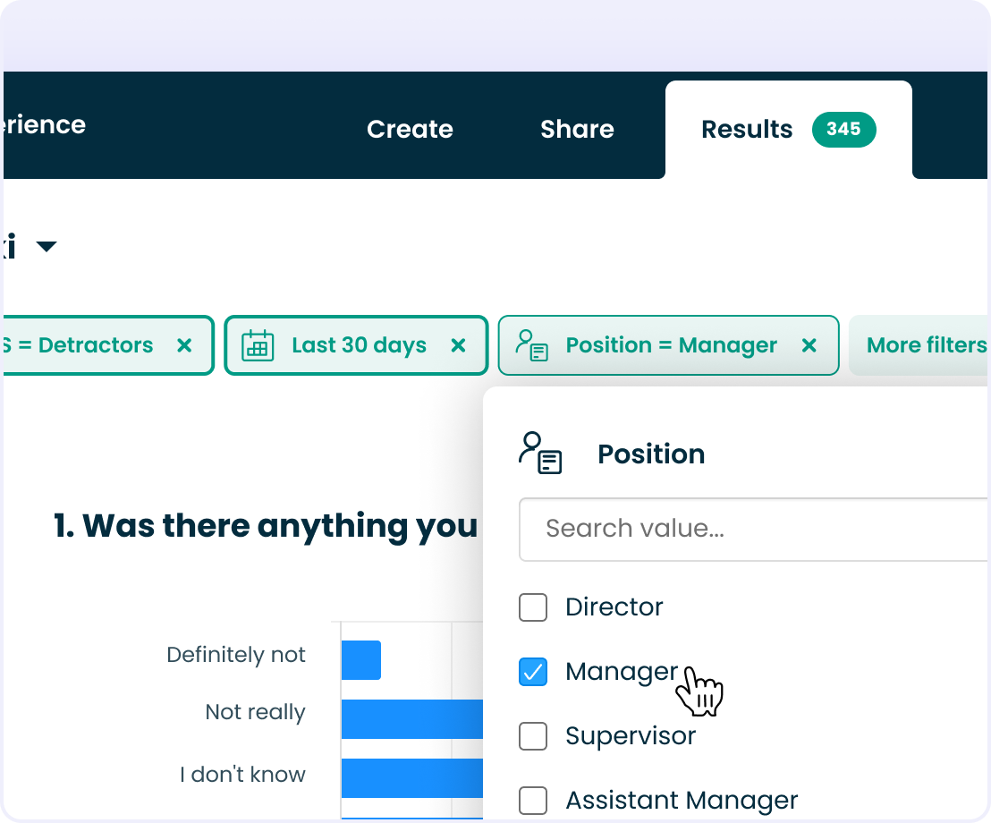
Survey results comparison – new trends step by step:
- Click “add comparison.”
- Choose the question you want to analyze
- Indicate the period for analysis
- We receive a chart with a trend line
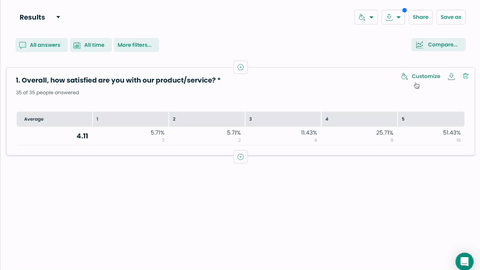
At this stage, we can adjust the appearance and color of the chart and decide whether to display it with a table or just the chart. Various methods of presenting results are available depending on the type of question.
It’s important to note that the trend or cross table created this way must be saved as a report by clicking “save as.”
You can find a complete instruction (with graphics) in the help section: How do you add a comparison?
Report on research results for the team/supervisors
We’ve already covered the theory and practice related to data analysis.
Now it’s time for the pièce de résistance of the whole affair, showcasing our work’s results to the world. If we were to immerse ourselves once again in the universe of superheroes, this is the moment when Bruce Wayne has already conquered his fear of bats, donned his bulletproof latex suit, tested all those gadgets on Alfred in hand-to-hand combat, and is ready to crush any villain tormenting Gotham.
The report with the research results will be our batmobile, which will not only astonish the opposite sex but anyone who crosses our path.
Wow effect in the boardroom presentation
Color schemes tailored to your brand’s requirements, clear graphs, and transparent charts enabling quick detection of correlations, an impressive image appealing to the imagination of perpetually busy executives much better than stacks of annotated pages with survey findings – yes, it’s time for a silent wow moment in the boardroom at last.
“Emphasizing comparisons helps to shine before an audience with an accessible and intriguing report. In an easy-to-understand way, we can graphically display more thorough analyses and deeper insights,” emphasizes Laura Dołęgowska.
Let’s add to this the ability to prepare a live report, which provides real-time access to research results (e.g., incoming satisfaction surveys or votes on specific solutions) and the awareness that all of this… can be generated with just a few clicks without a black belt in econometrics or the aforementioned expertise of a pro.
Doesn’t it sound enticing? I think so. Certainly, it is not as daunting as the vision of data analysis and reporting we had just a few minutes ago.
But that’s not all.
“Soon, the comparison function will be expanded to include a group of respondents, i.e., the possibility of crossing a question with specific respondent information, such as the department they work in for HR surveys or the store where they made a purchase, which may be crucial information for CX survey analysis,” adds Laura Dołęgowska.
Do you want to elevate your research results analysis to the superhero level?
Create an account and start analyzing feedback with Webankieta.